Web design is to a large extent a creative process and can, therefore, be called more art than science. By following some simple pointers, anyone should be able to create a visually pleasing design and take one step closer to fame. Okay, it’s not that simple, and talent and experience do matter, but anyone can turn their homepage into something prettier within mere minutes. Some websites cost a fortune to build but still look cheap and nasty. Others come in at a very reasonable price but look as classy as a classy thing from a very classy place. How do they do that? As it turns out, classy looks needn’t cost a fortune and achieving them can be a relatively simple matter. So what makes something pretty? It is not flash. Not to say that Flash has no merit, but Flash alone doesn’t make a design good; some nasty Flash websites are out there. Also, one doesn’t have to be a great illustrator to make appealing designs.
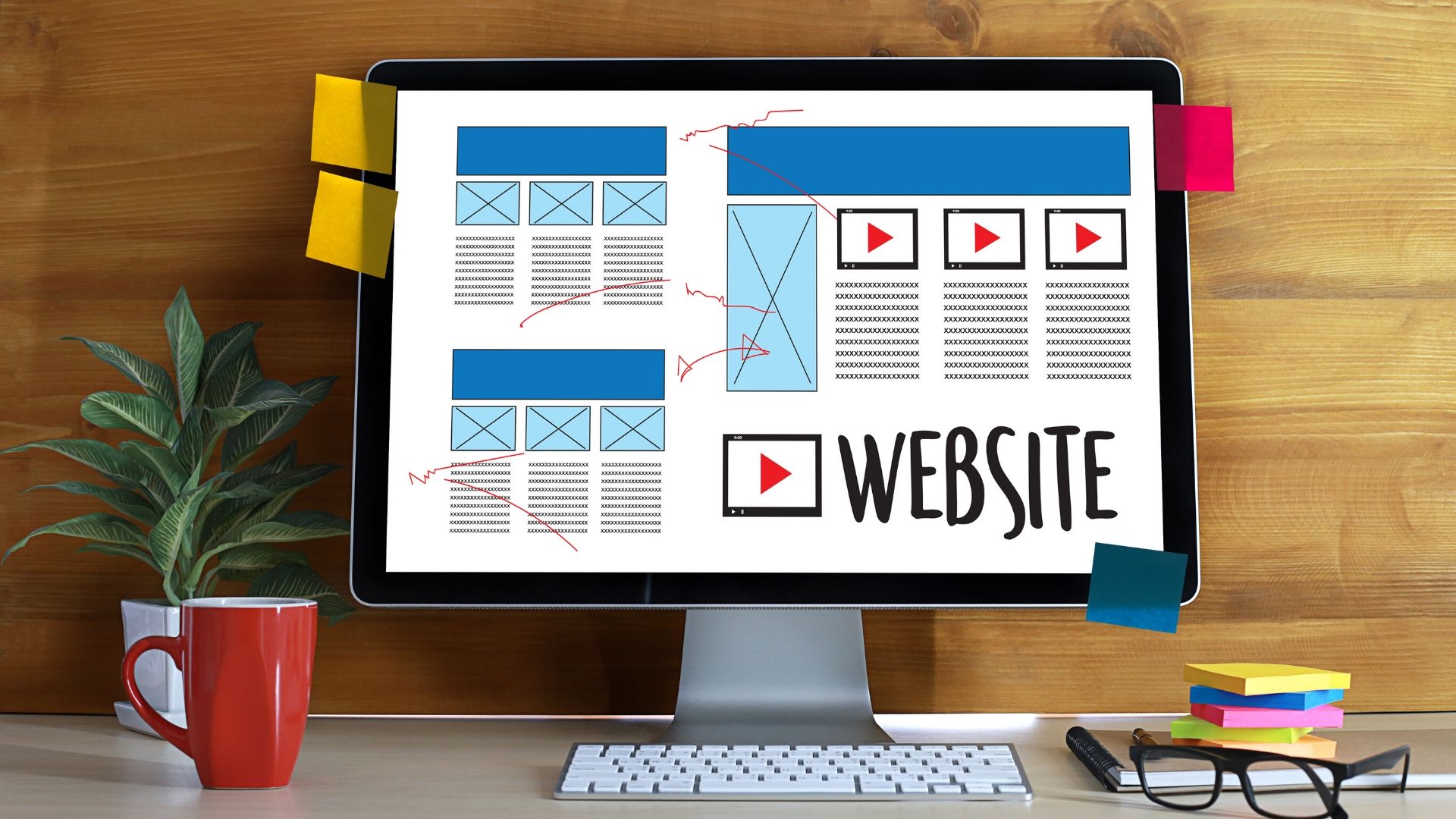
These elements are the 7 key principles that make a Web design look good:
❖ Balance
❖ Grid
❖ Color
❖ Graphics
❖ Typography
❖ Whitespace
❖ Connection
1. Balance
Balance is all about ensuring that your design does not tip to one side or the other. It is like the balance of weight in achieving symmetry or asymmetry.
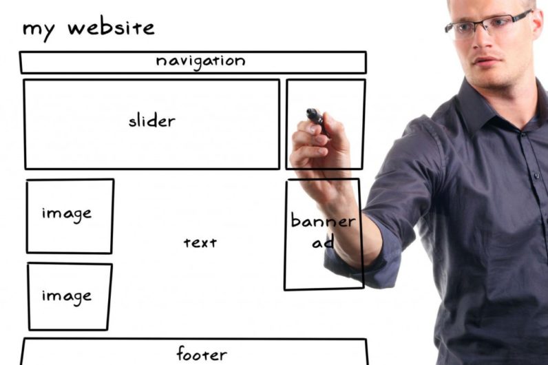
2. Grid
The concept of grids is closely related to that of balance. Grids are a series of horizontal and vertical rulers that help you “compartmentalize” a design. Think of columns. Columns improve readability, making a page’s content easier to absorb. Spacing and the use of the Rule of Thirds (or similar Golden Ratio) make everything easier on the eye.
3.Color
What if you changed the base red on the First Twenty website (above) to lime green? Would it look good? Most likely not. Because it does not belong to the same color palette (and of course lime green isn’t the easiest color to work with). Websites such as Color Lovers exist for a reason. You can’t just pick your colors Rambo-style, guns blazing. Some colors go well together, others don’t. A lot of theories on colors and their combinations exist, including conventions on monochrome and contrasting schemes, but a lot comes down to common sense and having a feel for it. The black and white convey chic and professional, while the red adds the spice that makes certain elements stand out and keeps the design from looking dull; of course, more than just red makes this design
interesting.
4. Graphics
The black and white convey chic and professional, while the red adds the spice that makes certain elements stand out and keeps the design from looking dull; of course, more than just red makes this design interesting.
5. Typography
The art of type is a tricky subject to talk about because it encompasses so many elements. While it can be regarded as a branch of design, one can spend a lifetime mastering all of its aspects. This is not the place to provide a complete typographic reference, so we will limit our discussion to what will benefit you in the short term.
6. White Space
White space, or negative space, has to do with what is not there. Like measure and leading, white space gives the text some breathing room and spatial peace. You can make elements stand out by adding white space to them. Copy, for example, shouldn’t look cramped. To ensure readability, make sure paragraphs have sufficient padding.
Perfume ads or an ad for a luxury product for that matter are known for their use of white space…loads of it; and a serif typeface for good measure.
7. Connection
“Connection” is a bit of a made-up term here, but it seems to be the best one for what we mean. The connection here refers to a Web design that has both unity and consistency. These two attributes demonstrate the professionalism of design (and thus it’s designer). They are very broad attributes. The design should be consistent in its use of colors, in its range of fonts, with its icons, etc. All of these aspects count; a design can look great and still suffer from inconsistencies.
UNDERSTAND YOUR AUDIENCE – LUXURY IS A MATTER OF TASTE
Luxury is actually a matter of taste. Say you’re selling an Aston Martin. The car’s legendary sophistication is conveyed powerfully via elegant serif fonts, making a clear association with old money. In contrast, if you’re selling an Italian sports car it’ll probably be much faster, slicker and younger, which the manufacturers portray using edgy sans-serif fonts and cutting edge website architecture.
FOCUS HARD ON TYPOGRAPHY, TYPOGRAPHY, TYPOGRAPHY
The most expensive-looking sites are invariably major with typographical excellence. Great typography alone can make a dramatic impression, which is why some luxury brands spend thousands on it. It’s good to track down Google fonts that work well in combination. Use excellent resources like this and don’t be scared to be bold.
AVOID STOCK PHOTOS
Try to avoid stock photos wherever possible. They have to be used very cleverly if you want to pull it off; otherwise, they just look a bit rubbish. There are countless professional photographers out there, many of whom are absolutely crying out for somewhere to showcase their work in exchange for a credit on the website or a link back to their portfolio.
GIVE THE PROFESSIONALS ENOUGH TIME
Give your website design company space and time to do a proper job. Be prepared to pay a fair price for the best-in-breed. Bear in mind that quality costs money. It may be better to compromise on a couple of pages or features to free up the budget you need to achieve something you can be proud of. If you’re the proud owner of a classy brand – or want to make your everyday brand look classy – it’s worth it.
Conclusion:-
With website design becoming easier and more accessible, people are able to customize` their websites to make them look unique and fit their style. However, not everyone knows of all the techniques available or may miss a trick or two on how to make their website stand out from the pack. Pheunix prepares a professional website at a proper time. For further information contact Pheunix.


