Reaching the attention and interest of visitors to your site, thanks to an attractive visual appearance and good ergonomics, is essential to make them want to stay on your site.
Consider Consumer Feedback
What questions do people still have after they see your site and how can you make changes to be more user-friendly? Customer feedback is crucial. You never want someone to walk away and still not understand what you do. You should always answer the customer’s queries. This will help you to increase your customers and also will increase your success.
Included a Video on Our Homepage
Studies have shown that websites with videos get significantly higher engagement. Have your marketing team create a high-quality video explaining who you are and what you do (or hire one of the many “explainer video” companies) and you’ll be well on your way to having a more interactive site. A video can explain your video better than any other description written on your website. This is an important point and should be included on your website. What is one simple way you made your website more visually appealing/interactive recently that
anyone can implement?
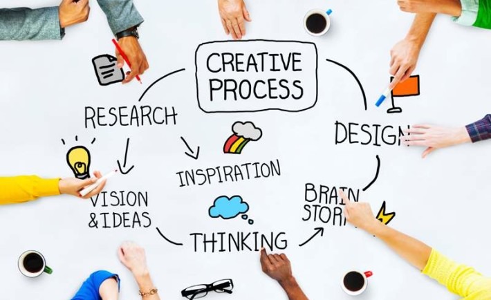
This article breaks down the 4 basics to great visual design for any website, anywhere:
1. Design & Color
2. Pictures & Graphics
3. Usability
4. Consistency
Design & Color
The first steps to making a website visually appealing are the colors you design with. It’s what first catches your eye as you bypass a bus. It’s what makes you pause when flipping through your Facebook feed. Color catches the eye and provides an instant layer of communication. Even before the conscious mind has started thinking, the subconscious has already assessed if something is interesting or not. Purely based on colors.
Your site should not be focused on what you think you want. It must be customer-first. Make it
easy to use:
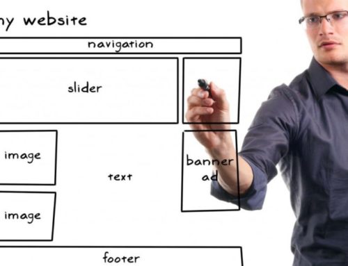
1. Make your menu/site navigation prominent, and simple.
2. Keep your content distinct from other elements, and easy to read.
3. Make your buttons stand out. They’re where the action happens.
4. Decide what is most important on any page, and then give it prominence. Don’t give everything the same attention.
5. Don’t put too much on the same page/screen. The more you include, the more you split your visitor’s attention.
Consistency
Consistency is often forgotten. Especially by particularly creative people. The consistent design allows the user to focus on the message.
An inconsistent layout means that every page forces the visitor to stop, relearn the language, and then get back to absorbing what’s important.
But what if you aren’t yet convinced that it’s important to you? We see sites like this all the time; they’re crammed with ads and content, and each page is laid out differently. A visitor takes one look, within 7 seconds decides that it’s going to take too much effort, and leaves to find a website that’s easier to absorb.
First of all, decide your three tiers of importance: primary importance, secondary importance, and
then deeper detail.
Your headlines and the above-the-fold area should convey the content with primary importance.
Then look at the rest of your page, and structure it so that someone scanning it gets a clear sense of what’s there to consume.
• All your quotes might have a solid color background. Do that everywhere.
• All your headings might be a certain size and color. Keep it consistent.
• Your images might look good grayscale. Make a brand choice, and then stick with it
everywhere.
Your visitor can trust that your service is as coherent and well constructed as your website. Once you’ve set up a ‘language’ for how to interpret your brand’s elements (text, photos, quotes, etc), use that layout everywhere.
Being consistent with your design language means that your visitors can spend less time trying to understand how you’re saying something, and have more time to absorb what you’re saying.
Pictures & Graphics
Good photography brings instant visual appeal, class, and quality. It’s still unusual today for a website to have well-composed and well-lit photos of teams and their offices. This is the easiest step to one-up your competition, and help build trust with your visitors. Take the time to avoid overtly ‘stock art’ material, and with a little effort upfront, you and your iPhone could help your website close the gap between you and your visitor.
Usability
Keep things easy to understand, and conventional. Don’t get cute with names, like ‘join the Pub’ instead of ‘Blog’, or ‘Main Lobby’ instead of ‘Home’ page.
Make your buttons distinct, your menu clear and simple, your page layout focused on what’s most important, and clear attention to readability.
If anything on here helped you, drop a link below to your reworked website! We can keep the feedback going, and increase your visitor conversions.
Conclusion:-
Creating a visually attractive non-profit site does not necessarily require a significant budget. However, improving your site, if your budget allows it, is a goal that may require expenses. Consider these few tips as a starting point to help you evaluate your existing website and ways that you can use to improve how you tell the story of your nonprofit with attractive visuals. Pheunix design that website that can be designed in your budget.